Geospatial visualisation (often known as GIS) uses data with links to place, such as a UPRN, a gps coordinate or map reference, to create interactive layers of information in a way that highlights the physical connection between data points. This way they can help tell stories about what the data means in way that people can engage with and develop insight from.
Maps are the primary focus of geospatial visualizations. They range from depicting a street, town, or local authority to showing the boundaries of a country, continent, or the whole planet. They act as a container for extra data. This allows you to create context using shapes and color to change the visual focus. They help identify problems, track change, understand trends, and perform forecasting related to specific places and times.
GIS for local energy projects
Visualisation of data for project location identification, impact and consultation are crucial aspects of local energy projects for LAs in their Net Zero initiatives.
GIS can be used to create interactive tools to inform strategic decisions, project and programme development as well as track impact and changes to their local area.
Examples of Geospatial Visualisation in decision making for local authorities
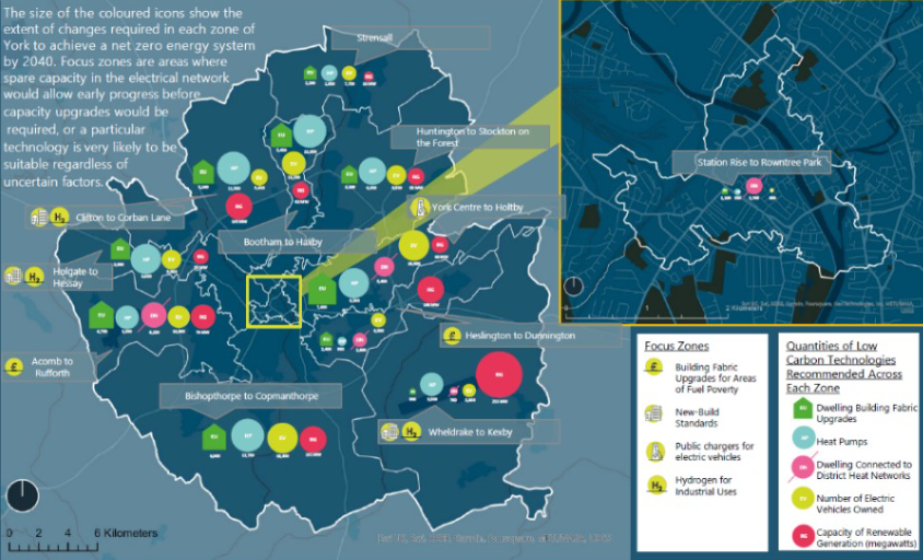
Local Area Energy Plans (LAEP) are recognised as the leading method for translating national Net Zero targets into local energy system action with plans that are collaborative, data-driven and cost-effective. Local Area Energy Planning is a integrated planning approach designed to define detailed place-based whole energy systems pathways and delivery plans for Net Zero.
LAEP provides an organised plan, at building level, to deliver on a Net Zero plan. This includes the size of investment required in different asset types, and confidence they are the right mix of interventions from a whole energy systems perspective.
LAEP uses mapping to both present complex layers of data, but also to provide approaches for stakeholders to understand the information
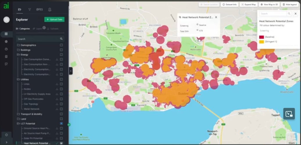
Many Local Authorities, DNOs, and Consultants struggle to cost-effectively identify and triage suitable sites for energy projects.
Project opportunities are missed and those that are selected face lengthy delays trying to access network capacity information, model energy demand, estimate carbon avoidance, and assess the feasibility of potential sites. This project-level information is often missing from local area energy plans which are typically static PDF reports that do not provide the granularity of data needed to translate a plan into a pipeline of projects
LAEP+ is currently being used to build energy plans, respond to grants, and identify and triage buildings suitable for heat pump grants, EVs, Rooftop PV, and more.
LAEP+ Features
Visualisation- A cloud based mapping and analysis tool to filter and analyse data in maps, charts, tables and graphs
Modelling-In browser calculations to quickly baseline an area and simulate the impact of different scenarios
Datasets- An on-demand repository of add-on datasets covering network capacity, EV utilisation, household income, PV potential and more.
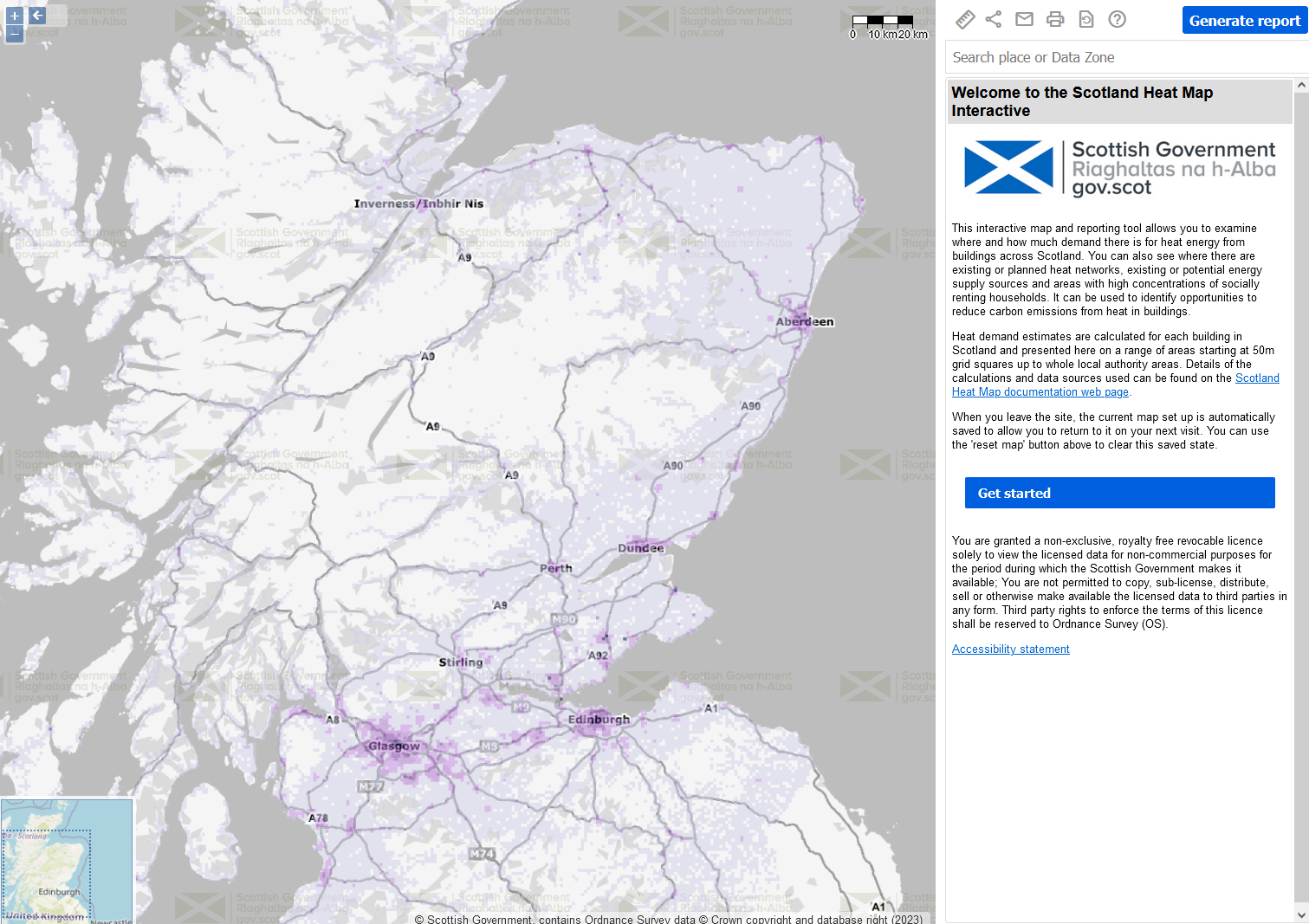
The Scotland Heat Map Interactive site and reporting tool allows anyone to examine where and how much demand there is for heat energy from buildings across Scotland. Heat demand estimates are presented for areas ranging from 50m grid squares to whole local authorities. The map can also highlight existing and planned heat networks and existing and potential sources of energy supply, alongside other relevant data. Most of the data in the interactive map can be downloaded in a range of formats including web mapping services, web feature services, text files and/or image files. Guidance on how to use the Scotland Heat Map interactive can be found in its quick user guide.
Every local authority in Scotland can access a more detailed heat map dataset covering their area. This data is shared via the Scotland Heat Map framework agreement. Other public sector bodies can register interest in accessing the data.
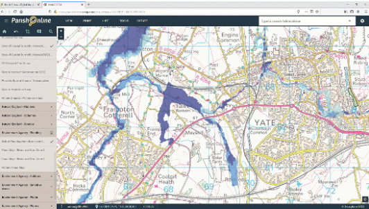
Parish Online is an essential tool for simply viewing and printing maps, all the way to storing asset registers, producing neighbourhood plans and engaging with the public.
With over 100 Map Layers pre-loaded and kept up-to-date, you'll be able to gain a greater understanding of your area.
The map layers included are chosen to help users with the most common council tasks. Whether you're finding something specific like an SSSI, or simply understanding the geography of your area, Parish Online is a fantastic source of information.
Layers such as parish boundaries, addresses, listed buildings and flood zones are regularly used by Parish Online users for day-to-day management tasks. Use Parish Online on your own computer, or project it onto a screen during a meeting to engage your audience.


 Guest preview of selected publicly available resources