A ‘heat-map’ chart is a powerful visualisation technique that can easily show ten weeks’ half-hourly data in a single screen.
Resource
A ‘heat-map’ chart is a powerful visualisation technique that can easily show ten weeks’ half-hourly data in a single screen.


A 'heat-map' chart is a powerful visualisation technique that can easily show ten weeks' half-hourly data in a single screen. In the chart each vertical slice is one day, running midnight to midnight top to bottom, with each half-hourly cell colour-coded according to demand to create a contour-map effect.
This for example is the pattern of a building's gas consumption.
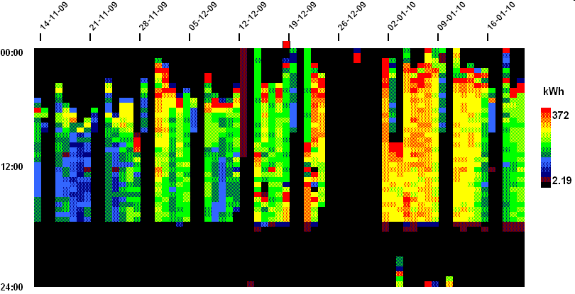
When you look at this example, you can see numerous features:
End of Preview
Designed to aid Local Authorities in developing robust, evidence-based plans to enable Net Zero.
Already have an account? Login
 Guest preview of selected publicly available resourcesFull library of 1,000+ articlesCPD accredited e-learning coursesCase studiesDiscussion forum